
Some of our favourite colour themes
Here, we are diving into the colour themes in JLE Studio projects. Sometimes our interior designers are led by our clients' requests, at other times our designers find themselves suggesting themes to bring contrast and colour to the project.
In every home we refurbish and design, each room is completely individual. Our talented architects create bespoke homes that are a result of detailed collaborations with our clients. We may work from a brief that says ‘we love neutrals’ or ‘include textures’, for example.
We often see clients favouring soft neutral schemes that are combined with luxurious textures and occasional pops of colour. We often include subtle shades of blues and greens, combined with metallic gold and bronze finishes. Yes, metallics are often considered to be ‘neutral’ in many of our schemes.

Neutral colour schemes
Neutral interior design schemes can be exquisitely intricate or extremely simple, and a far leap from boring beige walls. Pale neutrals are often treated as a background to let other features stand out within a room – perhaps an elegant staircase, an ornate chair, a colourful painting or a dramatic piece of sculpture. See an example of a neutral colour scheme we introduced to our beautiful Belgravia Pied a Terre project.
In contemporary rooms, such as a kitchen/dining space, the background colour is often a pale neutral. Pale ivory or grey tones, particularly in open plan spaces, enhance the sense of space and light. These schemes often feature mirrors and interesting lighting features

Natural colour schemes
We refer to ‘natural colour schemes’ where there are natural materials prominent in the scheme. Marble or stone panelling or tiles in bathrooms and timber panelling in living and dining areas bring natural themes to a room, and can pair with both colourful and pale tones.
Our bathrooms often feature a lot of glass and mirrors, which act to emphasise colours and patterns within the scheme.

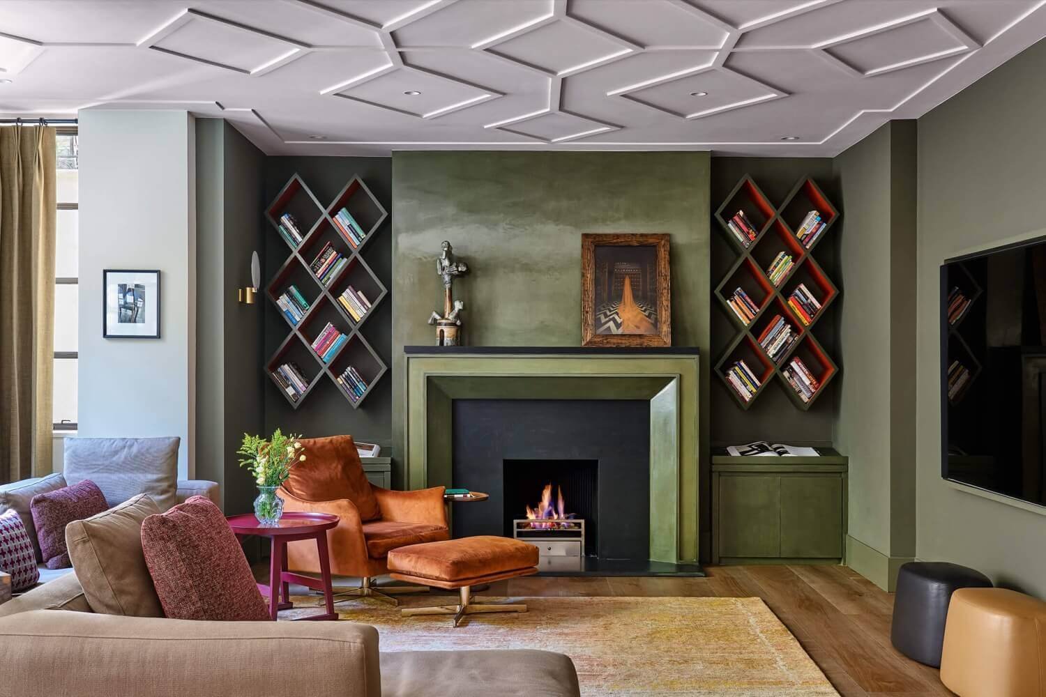
Bold colour schemes
A lot of successful and interesting colour schemes include what used to be called a feature wall. Designers tend not to use that term any more, but the concept of one wall being a strong colour, or using a highly patterned wallpaper, still works well. See our bold colour schemes in this Listed Chelsea Townhouse project where we worked closely with an interior designer to achieve a beautiful house refurbishment. It’s a good move for dining rooms, particularly when combined with a coordinating rug with darker or mid-blues offering calming shades, adding a sense of positivity without being overpowering.

Jewel box schemes
Bright, bold and darker colours can also be very successful in smaller rooms, concentrating an element of colour into a less obvious area. This idea is good if you want to keep the overall colour concept of the home subtle or understated, but like the option of including glimpses of jewel-like colours.
This idea is beautifully illustrated in our Kensington Town House project. The idea is to have pops of colour threading through the home whilst maintaining a coherent look throughout.

Subtle colour schemes
Subtle colour schemes are often the go-to choice in many of our refurbishment projects. Our clients may desire a soothing, calming look for their home. Soft, subtle shades can achieve this, whilst allowing room for interesting accessories and a pop of colour here and there.
Our designers are adept at creating subtle schemes which can be updated at various times by adding different accessories. They may at first glance look understated, but upon closer inspection will reveal beautifully textured fabrics and carefully chosen finishes for furniture.
The JLE Studio expert view
Every project has a bespoke colour scheme, created by our experts to meet the wishes and desires of our clients. Our architects provide the setting, our interior designers provide the colours and finishes that bring whole-house refurbishment schemes together.
Contact our team today to find out how we can help you achieve perfect colour schemes throughout your home.