
What is colour drenching in interior design?
Our interior design teams are responsible for creating interior schemes once the architectural plans are finalised. Here we explain the use and concept of colour drenching in interior design …
How to use colour drenching to enhance the details
As architects, we are dedicated to creating perfect interiors and exteriors for our clients. The detail of every aspect of the architecture - from skirting boards to ceiling roses and everything in between - is designed to enhance the proportion, balance and aesthetic of the home.
The next step, the interior design, is concerned with colour, décor and furnishings, and there is usually a creative liaison between architect and interior designer. This is particularly important when bespoke and fitted furniture is part of the scheme. The interior designer’s aim is to create a beautiful space where colours, finishes, fabrics and furniture all work in harmony. One way to create this harmony is to harness the creativity of colour drenching.


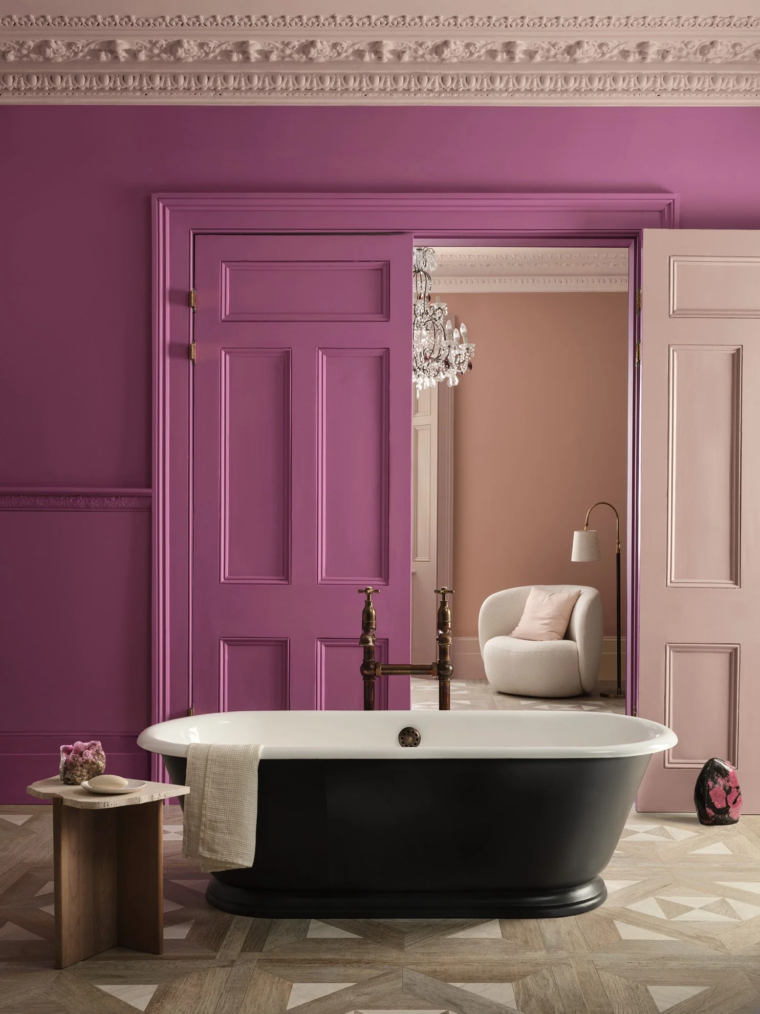
Above: Pitch Blue, Calke Green and Templeton Pink, all Farrow & Ball
What is colour drenching?
The term ‘colour drenching’ has gained popularity over the last few years, and describes the way that a single paint colour can be used throughout a room, from top to bottom. This approach works for both contemporary and traditional homes, resulting in a colour-saturated and cohesive look which can be subdued or striking. It’s the opposite of using different colours for ceiling, cornicing, wall, dado, below dado, then skirting board.
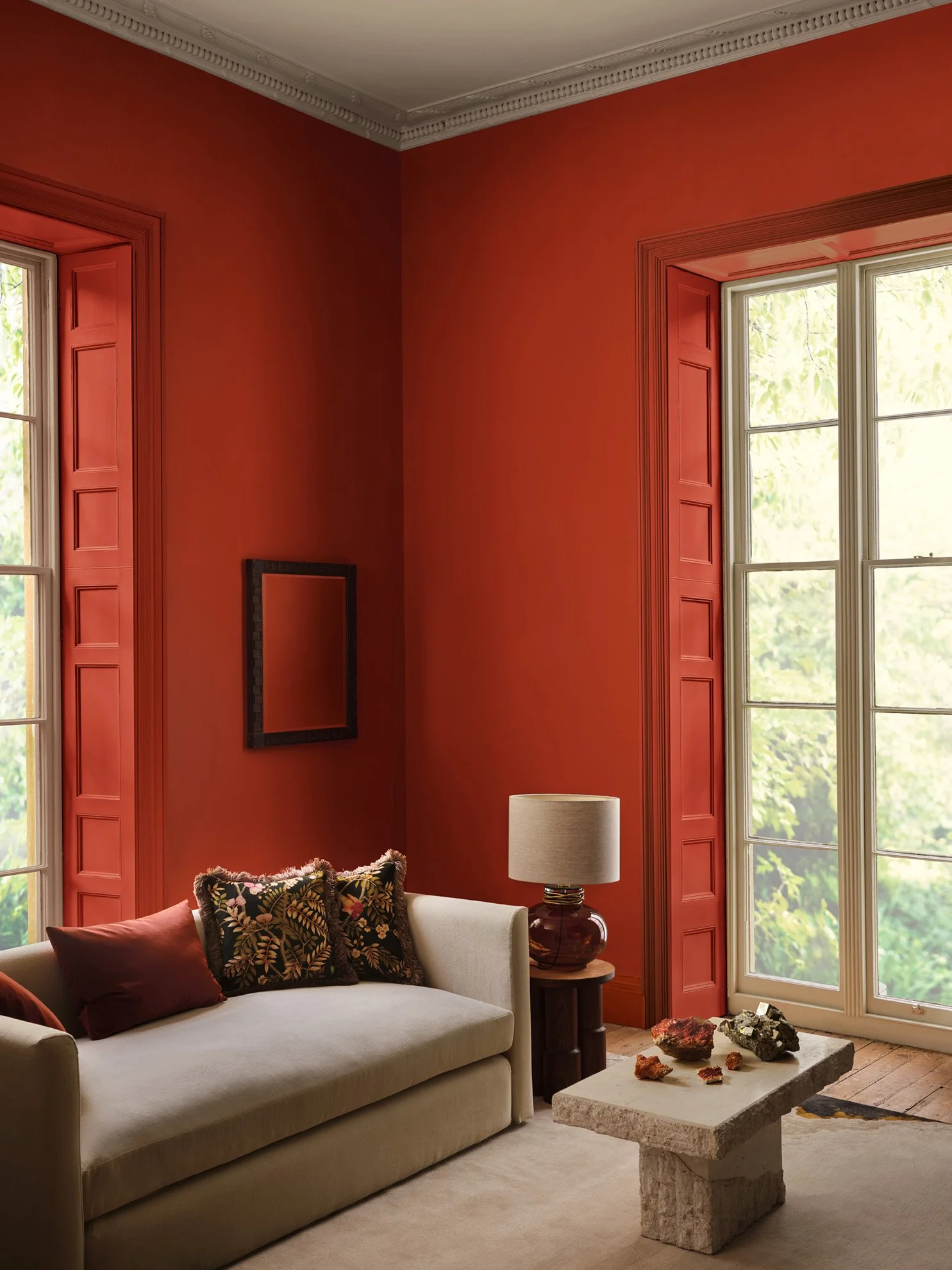
In period homes with interesting architectural details, such as intricate cornicing, elaborate skirting boards, panelling and architraves, using a single colour drenching scheme throughout allows the beauty of these details to be fully appreciated. Pale colours, such as off-white, ivory and muted creams, will enhance the light and space of the room. Dark shades, such as navy blue, forest green or burgundy, create a jewel-like look. The architectural details can still be seen, yet with the added impact of a bold colour.
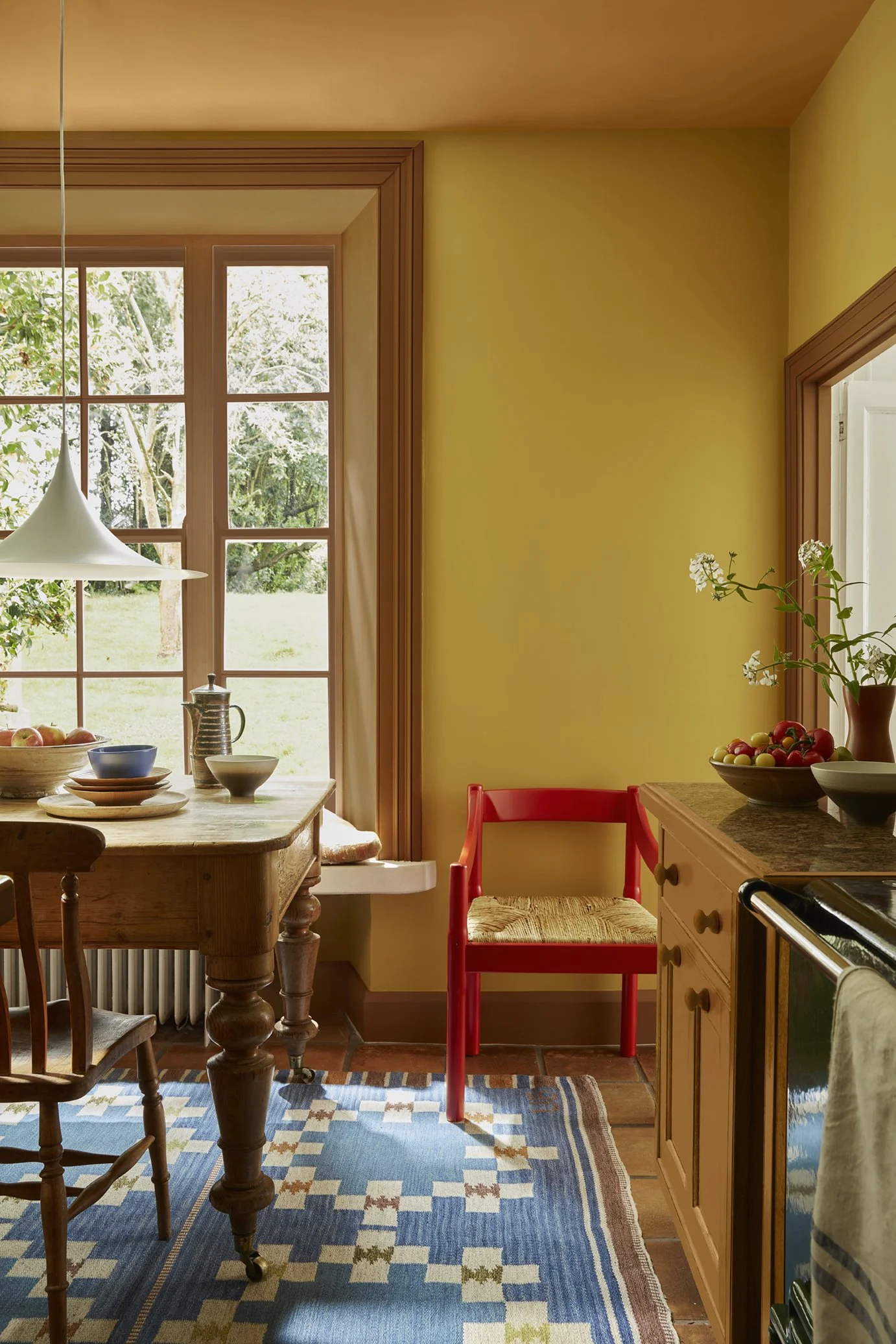
Contemporary homes can be equally impactful with the use of colour drenching. Modern kitchen-dining extension schemes often forego skirting boards, for example. The use of the same pale shade for ceiling to floor creates an embracing effect where kitchen cabinetry, dining furniture and perhaps a colourful rug all stand out within the scheme. Small rooms, such as a cloakroom, can also become an interesting and unusual space when colour drenched from top to bottom.
Is colour drenching suitable for all interior design styles?
Colour drenching can be used successfully for all interior design styles. It works where the designer wants to focus on a particular shade, perhaps at the request of a client for a ‘red dining room’ for example. It can also help smooth out awkwardly-shaped rooms, so the colour itself creates the impact, rather than the shape or proportion of a room. It can be used in both contemporary and traditional interior schemes.

Above: Pollen III and Peruvian Yellow; Cobalto, Plaster III and Roben’s Honour (bath); Atlas and Slate V, all Paint & Paper Library
How does this technique work?
Colour drenching makes a statement, particularly with dark or bright colours. Colour drenching can make a room feel warmer, cosier, more spacious or more glamorous, depending upon the chosen colour.
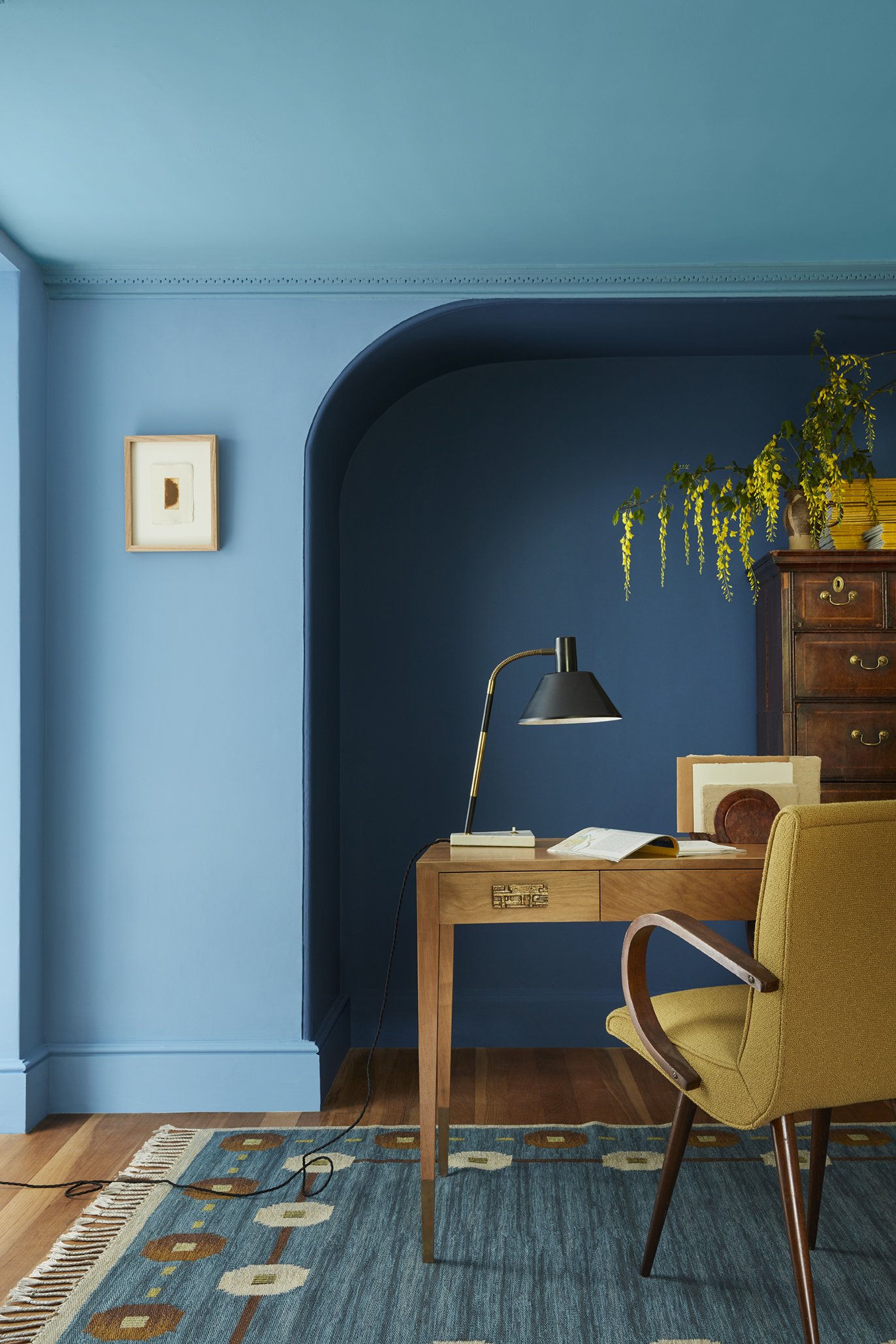
Ceilings are usually included in the theory of a colour-drenched scheme, but it may depend on the natural light within that room, particularly in darker or north-facing rooms. Some designers may prefer to colour-drench the walls only.
How to include the right paint shade for colour drenching
Some colour-drenched schemes can combine a couple of very similar shades, for example, a buttercup yellow and a slightly darker mustard, creating a similar colour-dense effect.
Ruth Mottershead, Creative Director, Little Greene, says, ‘It’s always fascinating to see how colour confidence and the use of colour changes over time. The understanding of the effect of colour on the atmosphere of a space is something that has grown exponentially over the past few years. Since first introducing the ‘Colour Drenching’ approach back in 2021, we have seen customers move away from traditional schemes to embrace deep and mid-tone hues from floor to ceiling and everything in between, creating really engaging, inviting spaces’.
How to choose the perfect finish for colour drenching
The paint finish is almost as important as the colour. Farrow & Ball recommends their Dead Flat finish for a perfect colour drench. It can be interesting to vary finishes, though. For example, an Eggshell or Gloss finish ceiling could be helpful in bouncing light back into the room. Of course, thoughtfully designed lighting systems play a significant role in the success of a colour-drenched scheme, offsetting dark tones and adding interest and uplift where needed. Our architects and interior designers can also create lighting schemes to enhance intense colour schemes.

Above: Blue Verditer, Tivoli, Woad; Middle Buff, Yellow-Pink, Affogato; Deep Space Blue, Mid Azure Green, Dock Blue (bath), all Little Greene
The JLE Studio expert view
Our architects and interior designers focus on every design detail and how those architectural aspects will look when the interior décor is completed. Colour drenching, when used with bright, dark or bold shades, can create an exciting and vibrant look. Our experts will help you get it right the first time, from a sunny yellow kitchen-dining room to a calm blue bedroom - and everything in between!
At JLE Studio, we provide expert interior design solutions for your architectural spaces – based on our years of experience.
Contact our team of architects today to discuss your project and how we can help create your perfect project.